Februrary 10, 2018
Good Day Traders,
The pullback/correction deepened this past week. In fact it was downright violent the last three days of the week. S&P intraday was down almost 12% from this years highs. This matched the drop on both the Dow & Nasdaq. The Nasdaq held above the long term 200 day moving averaged while both the S&P & Russell dropped and rebounded from this moving average. If price bounce from current levels, I will look to trade either UPRO or TQQQ.
Excellent article in Mike’s Macro Market Musing this weekend. His topic this weekend is “Reversion to the Mean & Long Term Trend Following”. Very timely for current market conditions.
Bounce Zones for Premium Members: If you are a premium member some very powerful conditional order setup information will soon be available to complement the “Go-No Go” Table each week. Chart showing zones where traders can expect prices to bounce due to supply and demand pressures. What does this mean for Premium members? Charts of our ETFs and Core Stocks with define Bounce Zones will empower you to place conditional orders around these areas for both entry and planned exits. This will be one more way Active Trend Trading will help Premium Traders with limit time for market analysis. Stay tuned for more on this beneficial feature!
Pre-Earning Runs: Both NVDA & TSLA provided great pre-earnings trades. So far this earnings season Premium Members have been provide excellent trade opportunities in NFLX, BABA & TSLA. These special opportunities come around every quarter. Kind of a bonus for Premium Members!
Mike’s Macro Market Musings: Mean Reversions and A Long Term Trend Following Update
For those of you who might be fairly new to ATTS and these columns, the concept of mean reversion in the financial markets is important for you to not only understand but to fully internalize and then proceed to utilize. It is a powerful force that inevitably is exerted when macro economies and markets get extended to extremes, whether to the upside or downside, regardless of which market is being referenced and what time frame is being examined. It is especially important when trying to understand and put into context recent U.S. equity index price action (keep in mind I am writing this on 2/7/18, just a couple of days after a significant and precipitous drop in the price of the indexes and an immediate snap back in same).
Historically, all markets and market metrics will revert back to some sort of mean, or average, – after all, that is how a mean (average) is established. This includes, but is not limited to, such things as valuation metrics (for example, p/e ratios), moving averages on price charts, corporate earnings trends, etc. In light of this truism, let’s look at just a couple of recent examples for illustrative purposes and try to establish a context for what happened recently and what might be reasonable to expect going forward from here.
P/E Ratios and the CAPE
Historically, the long term average trailing twelve month p/e ratio for the S&P 500 is around 15-16. At recent market highs of SPX at 2873, this had reached 26. While there is little doubt that this ratio will once again return to its long term average at some point in time, the question becomes what does SPX price action need to do to realize that? Assuming that SPX overall earnings remain constant (by no means a safe assumption), an approximate 40% correction in SPX price action will be required to get the p/e ratio down from 26 to 16. While a correction of that magnitude may seem unfathomable to many, it would be a fairly pedestrian pullback in the overall historical scheme of things, especially in light of the extreme overextensions in the markets we have seen in recent years
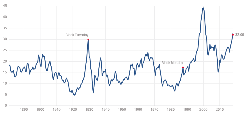
Another way of looking at this is to evaluate CAPE (aka Shiller P/E), the acronym for cyclically adjusted price/earnings (I’ll leave it to the reader to investigate just what CAPE measures if one is inclined to do so). The following chart will show the same basic story but from a more macro perspective:
Shiller P/E: 32.7 ( %)
Shiller P/E is 94.6% higher than the historical mean of 16.8
Historical low: 4.8
Historical high: 44.2
At a recent reading approaching 33 and a long term historical average of approximately 16-17, and assuming no change in the underlying earnings part of the ratio, a near 50% decline in SPX will be required from recent highs to get back to the long term average of this valuation metric. It has happened before, and it will happen again
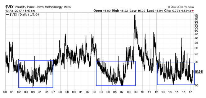
VIX: Without getting into too much detail, VIX is a measure of volatility in the S&P 500. The price action of VIX is almost perfectly inversely correlated with that of SPX. Since its implementation in 1986, the long term average price associated with VIX has been approximately 20-21. It routinely revolves around this long term mean, both to the upside and downside. For nearly all of 2017, the price level of VIX was severely suppressed, hovering around 10 for much of the year and never advancing beyond 17. Is it any surprise then that VIX was long overdue to revert back to its long term mean and even overshoot that mean in the process, as it is prone to doing and has repeatedly done in the past?
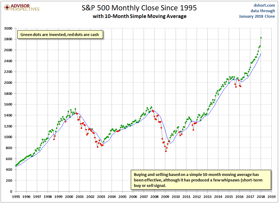
Moving Averages: In technical analysis, the concept of mean reversion is often utilized to reconcile extremes in price action relative to moving averages. Inevitably, when price gets too far away from certain important moving averages, a return or reversion of price to said moving average is quite predictable. For example, consider the following chart, which is a visual depiction and update of a long term trend following strategy I have been advocating and utilizing myself:
The blue line on the chart above is a 10 period simple moving average on the monthly chart of SPX. Note how, no matter how far away from the 10 month ma the price might be either to the upside or downside, it ALWAYS returns to the ma eventually. Always. I can show the same chart from the era of the Great Depression in the 1930’s and it will show the same thing. Also, note how extended price action currently is (as of the end of January, 2018) from the 10 month ma. There can be no doubt that, at some point in time, this will reconcile itself. The recent selling is really nothing more than the initial move in that process. Since this is a monthly chart, it will likely take a considerable length of time for that process to play out.
In light of all of the above, the extreme selling that we witnessed a few days ago can logically be viewed as nothing more than a mean reversion event. It was bound to happen, maybe not all in just 2 days as seen on 2/2/18 and 2/5/18, but predictable nonetheless. And there will be more of it, of that we can be assured, an expectation based on nothing more than the above monthly chart and the aforementioned valuation extremes.
And, lest one think of me as some sort of permabear, these sharp sell offs create interesting and lucrative shorter term buy opportunities as the price action significantly deviates to the downside away from shorter term moving averages on daily charts as we are witnessing on 2/6/18 and 2/7/18, predictable and powerful short term snap back rallies back up to at least those same shorter term moving averages. When compounded over long periods of time, the overall returns of trading these snap back rallies become truly impressive – this methodology comprises the very core of and the vast majority of my own personal trading activity
Mean reversion is likely one of the most powerful forces being exerted in the financial markets on both short term and longer term time frames, if not the most powerful force. It’s an important concept to know and utilize. Fortunes have been made by utilizing it. Over time, and utilized properly, it will do the same for you.
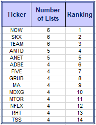
Remember to register for the After Market Monday and Making Money Trading Stocks and ETFs each week. In these webinars I will provide 10-12 stock set ups per year. All Levels of ATTS members will receive these trade email alerts. The NEW Composite Watch List provides a sort of all stocks that appeared on multiple Premium IBD Watch Lists this week. Often appearing on multiple list is a sign of strength and identifies a strong long term candidate. New Composite List Provided Below!
Register here to not miss the BONUS Trades or the ATTS Webinar Invitation list: https://forms.aweber.com/form/33/1084761733.htm
Running List, Strongest Fundamental stocks on the IBD 50 and the NEW Composite List of Stocks showing up on multiple IBD Watch List on Feb 10.
Running List: 85 stocks are on the 2018 Running list. Major swap out this week. Find the list here: Running 2-10
When the new IBD 50 list comes out twice per week I conduct a fundamental sort which results in the top fundamental IBD 50 stocks being identified. The top fundamental stocks for this week are: ANET, GRUB, HTHT & ABMD. This sort is provided at: 2-9 Sorted
A new addition to the weekly watch lists for Active Trend Traders is a Composite List of IPOs and Growth Stocks appearing on multiple IBD watchlist each weekend. When a stock appears on multiple Premium Lists it can potentially be an indication of excellent strength. The stocks on the weekly Composite List may not be at a sound trigger point but may be worth watching for future entries. I will do an analysis of the list looking for price near potential triggers. Stocks near potential triggers will be highlighted. The top stocks appearing on more than one IBD watch list last week are shown in the table below. The Composite List for this week: Composite 2-10


