
Seemingly appropriate to very recent index market price action is the following quote from the lyrics of a favorite Sheryl Crow song: “Everybody gets high, everybody gets low, these are the days when anything goes”. Now that the presidential election is over and the results known and we are aware of the tremendous volatility in index price action in the futures markets overnight and the day after, can we come to any conclusions that might guide us going forward? Are there any historical precedents by which we might project future market direction based on the past few days? Please keep in mind I am writing this less than 48 hours after election results were finalized; I know you’ll be reading this at a somewhat later date.
The answer to the above questions is YES, especially when we take a look “under the hood” to fully understand the nature of the explosive price action witnessed the day after the election. While I am unaware of anything that is perfectly 100% predictive I do think, it is a given that while history does not always repeat itself, it often rhymes. Much of the following is copied and pasted from elsewhere. If you would like to read the full article, here’s the link: http://www.zerohedge.com/news/2016-11-10/last-time-market-did-it-didnt-end-well .
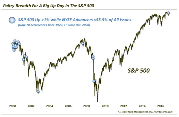
First off, while the stock indexes put in hefty gains by the end of the day on the day after the election, breadth was not nearly as strong by comparison. Specifically, though the S&P 500 gained more than 1% on the day, NYSE Advancing issues outpaced Decliners by a relatively thin margin of 1698-1386. At barely 55% of issues traded, this marked the weakest showing by NYSE Advancing Issues on a day the S&P 500 gained over 1% since October 2008. Since 1970, there have now been 70 occurrences whereby the S&P 500 gained at least 1% while NYSE Advancing Issues accounted for less than 55.5% of all issues, a relatively rare circumstance over a period of nearly 47 years. 32 occurred between 1970-1997. Another 32 took place during the great breadth divergence of 1998-2001. In the past 15 years, however, this situation has occurred just 5 times and, as previously mentioned, this is the first time this has happened since October, 2008.
As the following chart demonstrates, previous occurrences of this nature did not bode well in the short term for index price action. In the past 16 years, with the exception of one instance in late 2002 when the markets had already sold off significantly from the peak of the dot com bubble, we can see that in the following weeks and months there was further downside to come, and we can also see that in the very long term over a period of years the markets have eventually recovered and recouped those more intermediate term losses.
There is another aspect to this we might consider that also enjoys some historical precedent. Folks may be somewhat familiar with the “Hindenburg Omen”. I have mentioned it before. While admittedly less than perfect, this is a signal with bearish implications for stocks – as the name would imply. And while there are several criteria involved in the signal, the main tenet is an abundance of both new 52-Week Highs and 52-Week Lows. For whatever reason, those conditions were supposedly negative for the stock market’s prospects. Based on historical performance there does seem to be something to it.
Our most recent look at this abundance of New Highs and Lows came in July and August of 2015. And obviously, the warning sign for stocks implied by the large number of New Highs and Lows that triggered that July-August proved to be a valid one as the market would tank in late August, 2015, and again in early 2016. In the past 20 years, this set up or circumstance has occurred 28 times. The following chart will provide some context and demonstration of the follow through in past instances of these occurrences.
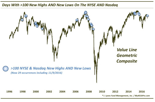
Guess what happened on 11/9/2016? If you have guessed that there were more than 100 new highs and 100 new lows on both the NYSE and the Nasdaq during a day of explosive upside market index price action, you would be correct. Although not always immediate, the chart illustrates just how timely, from a bearish perspective, these signals have been. In fact, as measured against the Value Line Geometric Composite, median returns across all time frames – from 1 week to 2 years – have been negative. And invariably, over the past 20 years as illustrated above, the downside follow through has been inevitable, if not in a time frame of several days then at least within a time frame of a few weeks or months. Most notable to me are the overwhelmingly negative prospects one to two years out and the nearly equal number of positive and negative returns over shorter time frames of one month or less. The further out in time we look from the days when this set up occurs, the more negative the returns become and, over a time frame of one and two years, there would appear to be little chance of a positive return. My examination of the above chart leads me to the conclusion that the only variable appears to be the magnitude of the eventual decline – it has apparently been significant on several occasions.
Additionally, on Friday, 11/11/2016, an even more rare circumstance arose if we measure the number of simultaneous new highs and new lows as a percentage of all stocks traded on the NYSE. Specifically, the number of new highs and new lows on 11/11/2016 each accounted for at least 5% or more of all issues traded that day for only the 12th time in the past 46 – 47 years. This is known as the “Akron Omen”. Let’s see what happened the past 11 times this situation has developed:

As one can see on the chart, all the prior instances occurred in fairly close proximity to cyclical market tops (the jury is still out on the 2 year results following the late 2014 occurrences, although there was some significant selling during the summer of 2015 and also in early 2016). S&P 500 returns following these occurrences have been unanimously poor – especially over a 2-month time frame – with a poor risk/reward scenario consisting of limited upside potential and possibly significant downside risk.
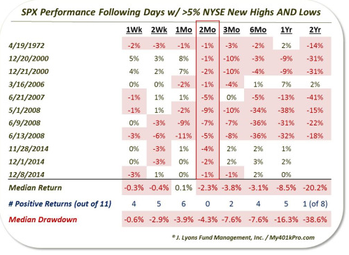
As the table shows, the return in the S&P 500 has been negative 2 months after all 11 occurrences. And it wasn’t just the 2-month period that was poor. Median returns are negative across nearly all time frames from 1 week to 2 years. The 2-year result is perhaps the most eye-opening after the 2-month. The market is not typically down over a 2-year period so to see 7 of the 8 instances lower is a rare result.
So, while anything can (and probably will) happen in the markets during the coming days and weeks, the longer-term outlook seems weak. And this projection is seemingly confirmed by historical market patterns around election cycles as previously illustrated in a recent column demonstrating a historical tendency for markets to experience an overall general downtrend over a period of 18 – 24 months when the incumbent party loses and the opposing non-incumbent candidate assumes the presidency, which is what just happened less than 48 hours ago. When a “cluster of clues” such as these present themselves to us it is usually wise to pay attention.
Is any of this actionable? Short term, probably not. Longer term, for core long term investments such as those in IRA accounts, 401 K’s, etc., I believe so. Again, history doesn’t necessarily repeat itself, but it often rhymes. And those who refuse to learn from history are often destined to repeat it. Or so they say.